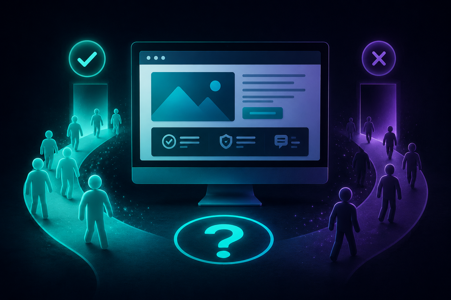
People leave websites without contacting the business for three primary reasons: they don’t quickly understand how the business can help them, they don’t trust what they’re seeing, or they aren’t given a clear next step.
In some cases, the website loads slowly, is difficult to use on a phone, or creates unnecessary friction through confusing layouts, long forms, or intrusive pop-ups. But more often than not, the biggest problem is messaging.
After 14 years and more than 300 website projects, I’ve found that most business owners assume they have a traffic problem when they actually have a conversion problem. People are finding the website. They’re just not taking action once they get there.
- Your website talks about your business instead of your visitor’s problem.
- Your calls-to-action are difficult to find.
- Your website creates friction through confusing layouts, forms, or pop-ups.
- Your site doesn’t build enough trust.
- Your website performs poorly on mobile devices.
- Your pages load too slowly.
Getting Traffic But No Leads Is Usually a Conversion Problem
When a business owner tells me, “People are visiting my website, but nobody is contacting me,” the first thing I want to know is whether this is actually a traffic problem or a conversion problem.
Those are not the same thing.
If nobody is finding your website at all, then yes, you probably have a visibility or SEO problem. But if people are already landing on your website and leaving without calling, filling out a form, booking an appointment, or buying, then the issue is usually conversion.
In plain English: people are getting there, but the website is not convincing them to take the next step.
That usually means one of two things is happening. Either your messaging is off, or visitors do not have a clear path to contact you when they are ready.
In fact, many service businesses assume they have a traffic problem when they actually have a conversion problem. If your website is getting visitors but not generating inquiries, you may be dealing with some of the same issues I discuss in Why Service-Based Business Websites Struggle to Get Leads.
Your Website May Be Talking About the Wrong Thing
One of the fastest ways to lose someone is to make your website all about you.
Yes, your experience matters. Your credentials matter. Your story may matter. But that is usually not what someone needs in the first few seconds.
When someone lands on your website, they are trying to answer a very specific question:
“Is this the right person or company to help me with what I am dealing with?”
If your homepage starts with something like “Welcome to XYZ Company,” you are wasting valuable space. And if it says that three different ways before it tells me what you actually do, who you help, or what problem you solve, people are going to leave.
What Your Website Needs to Say Quickly
Above the fold, which means the section someone sees before they start scrolling, your website should quickly answer:
- Who do you help?
- What problem do you help them solve?
- Where do you serve them, if location matters?
- Why are you the right person or company to help?
- What should they do next?
A weak homepage headline might say:
Welcome to Sunshine Pediatric Therapy
That is not terrible, but it does not tell a parent very much. A stronger headline would be:
Pediatric Physical Therapy in Orlando for Children Who Need Extra Support With Movement, Strength, and Confidence
That version tells the visitor what you do, where you do it, who you help, and what kind of outcome they are looking for.
That is the difference between copy that fills space and copy that helps someone decide whether they are in the right place.
People Leave When They Do Not Feel Understood
There is so much noise online. Everyone is comparing options. Everyone is skimming. Everyone thinks their problem is a little bit unique.
When your website describes what someone is experiencing in words they recognize, something changes. They feel understood.
And when someone feels understood, they are much more likely to believe you can help them.
This is where a lot of service business websites fall flat. They list services, credentials, and generic statements, but they do not connect the service to what the visitor is actually dealing with.
People are not just looking for “physical therapy,” “counseling,” “screen repair,” “website design,” or “consulting.” They are looking for relief from a problem.
They want to know:
- Do you understand what I am dealing with?
- Have you helped people like me before?
- Can you help me solve this without making the process harder?
- What happens if I contact you?
- Will I feel stupid, pressured, ignored, or overwhelmed?
Your website has to answer those questions, even if the visitor never says them out loud.
Problem-Aware Does Not Mean Problem, Problem, Problem
Your website copy should be problem-aware, but solution-focused.
This distinction matters.
Sometimes, especially when people use ChatGPT to write their website copy, they end up with a page that says problem, problem, problem, problem all the way down the page.
That does not build confidence. It can make the page feel heavy, generic, or manipulative.
Yes, your website should show that you understand the problem. But then it needs to move the visitor toward the solution.
Good website messaging should make someone think:
“Yes, that is exactly what I am dealing with. And this person seems like they know how to help.”
Not:
“Wow, this page just reminded me of every painful thing I am trying to fix and now I still do not know what to do.”
Flashy Design Does Not Automatically Create Leads
A lot of business owners think they need a flashy website to get more leads.
I get why. A polished website feels more professional. A beautiful design can absolutely help build trust. But after 14 years in business and 300+ website projects, I can tell you something that still feels mind-boggling sometimes:
Some ugly websites convert.
They convert because the messaging is clear. The visitor knows what the business does. They know who it is for. They know what problem it solves. They know how to take the next step.
Meanwhile, a beautiful website with vague copy can sit there looking expensive and doing absolutely nothing.
Your website does not need to be the flashiest website in your industry. It needs to be clear, helpful, trustworthy, and easy to use.
That doesn’t mean design is unimportant. Good design helps build trust, improves usability, and supports your message. The key is making sure design and strategy work together. You can learn more about that in Why Web Design Is Important for Business.
Your Contact Button Cannot Only Live in the Menu
One of the most common things I hear is, “But I have a contact button in the menu.”
That is not enough anymore.
Your contact button should appear where someone naturally reaches a decision point on the page. If they have just read a section that explains your service, answers a concern, or shows them why you are a good fit, do not make them scroll back to the top and hunt for the next step.
Give them a clear action right there.
Where Calls-to-Action Often Belong
- Near the top of the homepage.
- After the main explanation of your service.
- After a section that addresses a major pain point.
- After testimonials or proof.
- At the bottom of every important page.
- On mobile in a place that is easy to find and tap.
This does not mean every button needs to scream “BUY NOW.” For service businesses, the next step may be softer:
- Schedule a consultation.
- Request an appointment.
- Get a quote.
- Ask a question.
- Start with a free discovery call.
- Contact us to talk through your project.
The exact wording depends on the business, but the goal is the same: make the next step obvious.
If you’re unsure whether your contact process is helping or hurting conversions, your contact page may be playing a larger role than you realize. I break down common mistakes in Your Contact Page Might Be the Problem. Here’s How to Fix It.
Friction Can Kill Conversions Fast
Sometimes the issue is not the entire website. Sometimes one small piece of friction is enough to stop people from taking action.
I worked with one client whose website asked visitors for their email address in a pop-up after they clicked to add a service to the cart. That extra step created friction at the exact moment someone was trying to purchase.
We removed that obstacle and changed some of the language on the pages. His conversion rate doubled.
That is why I look closely at what happens between “I am interested” and “I am ready to act.”
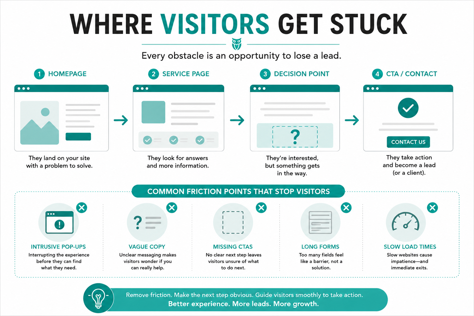
If you make people jump through hoops, answer unnecessary questions, close pop-ups, search for contact information, or figure out a confusing checkout process, some of them will leave.
Common Conversion Friction Points
- Pop-ups that interrupt someone before they can take action.
- Contact forms that ask for too much information.
- Buttons that are hard to find.
- Service pages with no clear next step.
- Mobile layouts that make buttons hard to tap.
- Checkout pages with unnecessary steps.
- Broken links or forms that do not work.
- Pages that load slowly because of oversized images or bloated layouts.
 Generic ChatGPT Copy Is Costing Businesses Leads
Let me say this directly: taking copy straight from ChatGPT and pasting it onto your website is costing you leads.
Period.
That does not mean AI cannot help you brainstorm, organize ideas, or get unstuck. But generic AI-written copy usually sounds like everyone else. It is polished, but not personal. It is grammatically fine, but not specific. It often says a lot without actually saying anything useful.
And visitors can feel that.
Your website copy needs to sound like it came from someone who actually understands your clients, your process, your industry, and the problems people bring to you.
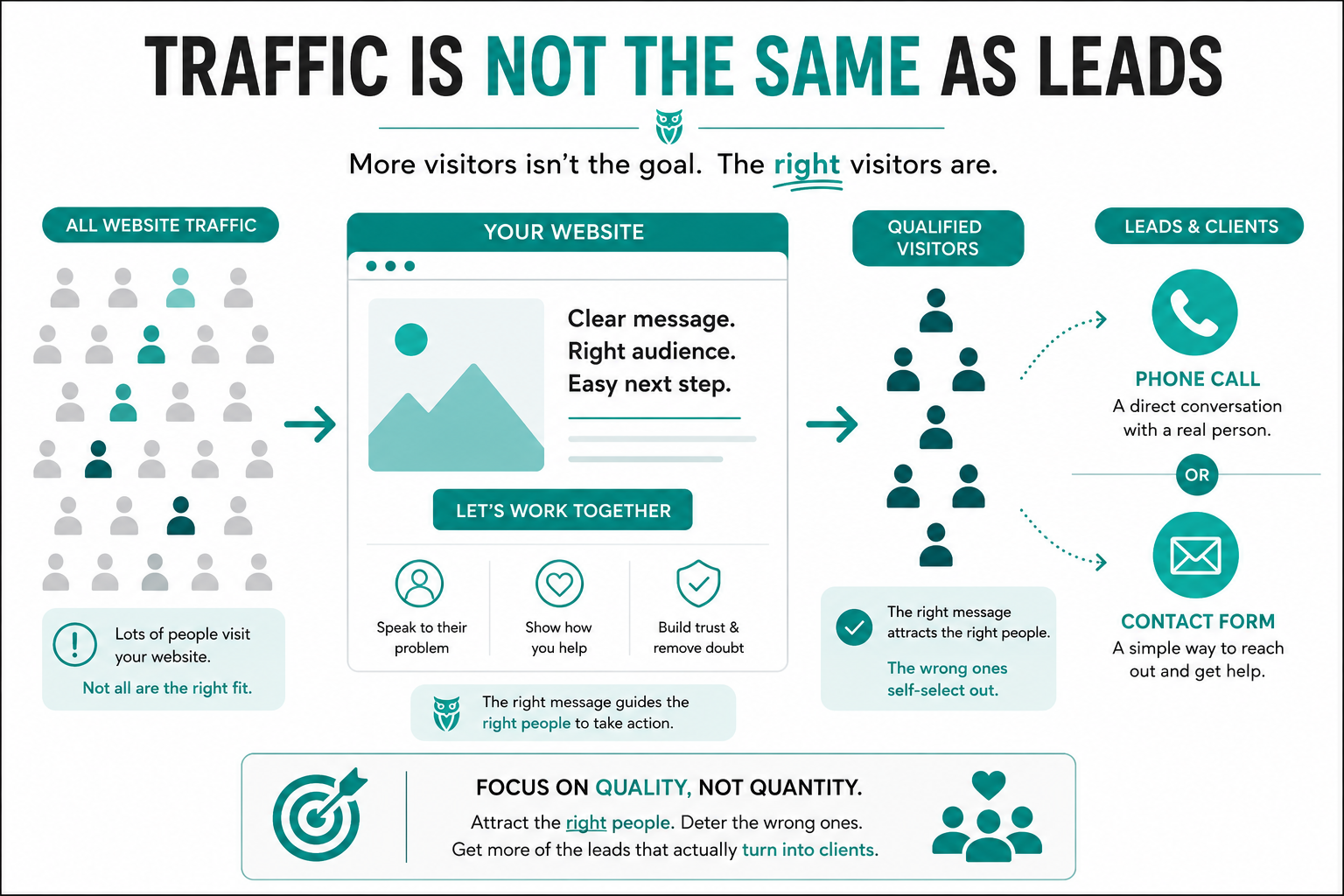
Generic copy attracts generic inquiries. Specific copy attracts better-fit leads.
Your Website Should Attract the Right People and Deter the Wrong Ones
Most business owners worry about turning people away.
But your website should turn some people away.
That is not a bad thing. That is part of making your website work.
If your website attracts a bunch of people who cannot afford you, do not value what you offer, are not a good fit for your process, or need something you do not want to provide, then your website is creating more work for you.
For example, if a pet sitting business charges $40 for a dog walk because they serve high-end clients and provide a premium experience, the website should not be written to attract someone looking for a $20 dog walk.
That person is not wrong. They are just not the right fit.
A good website helps the right people recognize themselves and take action. It also helps the wrong people self-select out before they waste your time.
More Traffic Is Not Always the Goal
For small businesses, it is not always about getting thousands of visitors and thousands of inquiries.
Sometimes the better goal is hundreds of visitors and a handful of the right inquiries.
I had a counseling client whose calls doubled after three months of SEO work. They became booked out and had to hire a third therapist because so many inquiries were coming in.
That is the kind of result most small businesses actually need.
Not vanity traffic. Not random visitors. Not leads that are never going to become clients.
The goal is qualified inquiries from people who are a good fit for what you offer.
Trust Matters More Than You Think
People also leave websites when they do not trust what they are seeing.
Sometimes the issue isn’t that people don’t trust your business. It’s that your website no longer reflects the quality of the work you do. If you’ve ever hesitated to send someone to your website, you may relate to I’m Embarrassed to Send People to My Website. Now What?.
That does not always mean they consciously think, “I do not trust this business.” Sometimes it is quieter than that.
They may notice that the website looks outdated. Or the layout feels disorganized. Or the copy is vague. Or the contact information is hard to find. Or the page feels like it has not been touched in years.
Any of those things can create doubt.
For service businesses, trust is everything. People are often inviting you into their home, trusting you with their health, hiring you for an important project, or asking you to solve a stressful problem.
Your website needs to make them feel like they are in capable hands.
Simple Trust Signals That Help
- Clear contact information.
- Recent testimonials or reviews.
- Service details that explain what to expect.
- Photos that feel real and relevant.
- Professional but approachable copy.
- Working links, forms, and buttons.
- A mobile layout that is easy to use.
- Pages that load quickly and feel current.
Mobile Problems Can Quietly Cost You Leads
A website might look fine on desktop and fall apart on a phone.
That matters because many people will find your business from their phone, especially if they are searching locally or making a quick decision.
If your mobile site forces someone to pinch and zoom, scroll sideways, fight with a menu, or tap tiny buttons, they may leave before they ever read your content.
Mobile usability is not a bonus anymore. It is part of whether your website feels credible and easy to work with.
Slow Load Times Can Stop People Before They Read Anything
Sometimes visitors leave before your messaging even has a chance to work.
If your website loads slowly, especially on mobile, people may bounce back to Google and click someone else.
Speed is not the only thing that matters, but it is one of the first barriers. Large images, heavy plugins, bloated layouts, poor hosting, and unnecessary scripts can all make a site feel sluggish.
A slow website tells people, “This might be more work than it is worth.”
And online, people do not usually wait around to be proven wrong.
How I Check Whether a Website Is Helping or Hurting Conversions
When I review a website, I usually start with a few key areas.
First, I look at the heading structure. The headings often reveal whether the page is organized clearly or whether it is confusing for both users and search engines.
Then I look at the call-to-action buttons. Are they easy to find? Are they placed where someone would naturally be ready to take the next step? Or is the only contact button hiding in the navigation?
Then I look at the homepage messaging. Can I tell quickly who the business helps, what they help with, and why someone should choose them?
Those three things usually tell me a lot.
- Is the page clear?
- Is the message specific?
- Is the next step obvious?
- Does the page build trust?
- Is the visitor being guided or left to figure it out alone?
A Quick Website Conversion Checklist
| What to Check | Why It Matters | What to Fix |
|---|---|---|
| Homepage headline | Visitors need to know they are in the right place quickly. | Say who you help, what you do, where you do it, and what problem you solve. |
| Messaging | Generic copy does not make people feel understood. | Make the copy problem-aware but solution-focused. |
| Calls-to-action | People leave when they do not know what to do next. | Add clear buttons throughout the page, especially after decision points. |
| Trust signals | Visitors need to feel safe contacting or hiring you. | Add reviews, clear contact details, real photos, and helpful service information. |
| Mobile layout | Many visitors are viewing your site from their phone. | Make sure text, buttons, forms, and menus are easy to use on mobile. |
| Friction points | Unnecessary steps can stop people from converting. | Remove intrusive pop-ups, simplify forms, and make checkout or contact easier. |
| Page speed | Slow pages cause people to leave before reading. | Compress images, remove unnecessary bloat, and improve hosting or caching. |
Why People Choose One Business Over Another
I have had clients tell me that people chose them because of what their website said.
Not because it was the flashiest. Not because it had the most animations. Not because it sounded like a corporate brochure.
Because the website made the visitor feel like, “This person gets it.”
One client changed the copy on her website and later told me she had four calls on a Monday. Several of those people had found her through Google and chose her because of what the website said.
Another client had built her own website. We redid it, made the messaging clearer, and people started finding her through Google too.
That is what good website copy and structure can do. It helps people make a decision.
Not Sure If You Have a Traffic Problem or a Conversion Problem?
One of the biggest mistakes I see business owners make is assuming they need more traffic when the real issue is what happens after someone lands on the website.
Before investing in more SEO, more ads, or more marketing, it’s important to understand where the breakdown is happening. Are people failing to find your website, or are they finding it and choosing not to contact you?
If you’re not sure whether your website has a traffic problem, a conversion problem, or both, schedule an SEO audit. We’ll review your messaging, calls-to-action, user experience, technical SEO, and conversion opportunities to identify what’s preventing visitors from becoming leads.
Your Website Does Not Have to Stay This Way
If people are visiting your website and leaving without contacting you, it does not mean your business is broken.
It does not mean your offer is bad.
It does not mean you need to throw away everything and start over from scratch.
It means something on the website is not doing its job yet.
Maybe the messaging needs to be clearer. Maybe the calls-to-action need to be placed better. Maybe the site needs to load faster. Maybe the mobile version needs work. Maybe the page needs to do a better job building trust.
All of that can be fixed.
The worst thing you can do is ignore it and hope the website magically starts converting later.