
If the thought of sending someone to your website makes your stomach drop a little, you are not alone.
I have had business owners avoid posting their website on social media, send people to Instagram instead, or panic when someone says, “Can you send me your website?” And honestly? I get it.
I fear being judged by my website….and I build websites.
Your website feels personal. It is tied to your business, your reputation, your ideas, your money, your time, and sometimes years of “I know I need to fix that” sitting quietly in the back of your brain.
But here is the good news: your website is not set in stone. It can always be changed.
Sometimes you need a full redesign. Sometimes you need better messaging, better photos, clearer navigation, or a stronger call to action. The goal is not perfection. The goal is creating a website you can confidently send people to because it represents your business clearly and helps visitors take the next step.
Why Business Owners Feel Embarrassed by Their Website
Most people come to me because they think their website is ugly.
They built it themselves and could never quite make it match the vision in their head. They had an assistant build it, but the assistant had never built a website before. A friend of a friend wanted to “learn websites,” so they gave it a shot for free, and now the site is half-finished, confusing, or nowhere close to what the business actually needs.
That embarrassment usually starts with how the website looks, but once we dig in, there is usually more happening underneath the surface.
The messaging may be unclear. The navigation may be confusing. The homepage may not explain who the business helps or what they actually do. The calls to action may be missing. The photos may feel outdated or low-quality. The content may sound like it was copied straight out of AI and pasted onto the page without being shaped into anything useful.
That is when the website starts feeling heavy.
You know people are judging your business based on what they see online, and when your website does not reflect the quality of your work, it becomes harder to share it confidently.
Website Embarrassment Usually Comes From More Than Bad Design
Design matters. I am not going to sit here and pretend it doesn’t.
Bad photos, outdated layouts, awkward spacing, and mismatched fonts can absolutely make a website feel less professional. But in my experience, the bigger issue is usually the way the website works for the person visiting it.
I once worked with a therapist who had built her own website. The problem was not just that it looked homemade. The bigger issue was that every page had the same heading section. When a visitor clicked from one page to another, it was not clear they had gone anywhere new. That creates confusion, and confused visitors do not usually stick around.
I have also seen service business websites where important information was added as images or PDFs instead of actual website text. That means visitors may struggle to read it, and search engines have a harder time understanding what the page is about.
Then there are websites where someone uses heading tags just to make text bigger. Suddenly, testimonials are marked as H2 headings, sections are out of order, and the page structure becomes messy for both users and search engines.
This is why a website can “look fine” at first glance but still struggle to bring in leads. A good website needs more than nice visuals. It needs structure, clarity, and a clear path for visitors to follow.
If you want a deeper breakdown of why this matters, I wrote more about it in why web design is important for business.
What Your Website Embarrassment May Actually Be Costing You
Being embarrassed by your website is expensive because it changes how you show up.
You stop sharing your link. You send people to social media instead. You avoid posting your website on Facebook, Instagram, LinkedIn, or your email signature. You hesitate when someone asks for your URL.
That is the moment a website problem becomes a business problem.
How Website Embarrassment Affects Your Marketing
| What You Feel | What You Do | What It Costs |
|---|---|---|
| Embarrassed by the design | Avoid sharing your website | Fewer people see your services |
| Unsure if the message is clear | Send people to Instagram instead | Visitors miss the full picture |
| Worried people will judge you | Hold back in networking and referrals | Missed opportunities |
| Frustrated by poor performance | Delay fixing the real issue | Lost leads over time |
Your website should be a business tool. It should help people understand what you do, trust your expertise, and take the next step. When it becomes a source of anxiety, every other part of your marketing feels harder.
Your Website Might Need Better Messaging Before a Full Redesign
One of the biggest things I see is this: business owners think their site needs to look better, but what it really needs is to communicate better.
Your homepage should quickly answer three questions:
- Who do you help?
- What do you help them with?
- What should they do next?
That means “Welcome to [Company Name]” is usually one of the first things I would replace.
That headline space is valuable. Use it to tell visitors they are in the right place. A service-based business website should not make people dig to understand what you do. It should make the next step obvious.
For example, instead of:
Welcome to Smith Family Services
You could say something more specific, like:
Compassionate In-Home Care for Seniors in Central Florida
That tells people who you help, what you offer, and where you serve. It gives the page a purpose right away.
If your website has too much content, unclear service pages, or visitors are not converting, this may also be part of the issue. I broke that down further in why service-based business websites struggle to get leads.
When an “Ugly” Website Still Converts
This might annoy some designers, but it is true.
There are some of the ugliest websites on the planet that convert better than the most beautiful websites ever designed.
A beautiful website can still fail when the message is vague, the offer is unclear, the pages are hard to navigate, or visitors do not know what to do next. A less polished website can still bring in leads when it clearly explains the service, builds trust, and makes contacting the business easy.
That does not mean you should ignore design. It means design should support the strategy.
Pretty is nice. Clear is better. Pretty and clear together? That is where things start working.
Quick Website Fixes You Can Make Before a Redesign
If you cannot afford a full website redesign right now, start with the fixes that make the biggest visible difference.
Start Here If You Hate Your Website
- Replace poor-quality photos. Better images can immediately make a website feel more professional.
- Rewrite your homepage headline. Tell people who you help and how you help them.
- Add clear calls to action. Make it obvious how someone can contact you, book a call, or request information.
- Clean up AI-generated copy. If you pasted content directly from ChatGPT or Claude, review it for clarity, structure, and personality.
- Simplify your navigation. Visitors should be able to find your services, about page, and contact information quickly.
- Check your core pages. At minimum, most service-based businesses need a homepage, about page, services page, and contact page.
These changes can help you stop feeling so much dread when someone asks for your website. They can also help visitors understand your business faster.
If you are unsure what pages you should have, start with this guide on what pages every business website should have.
When a Website Redesign Is the Better Move
Sometimes small fixes are enough. Other times, the website needs a more complete reset.
A redesign may be the right move when your content is disorganized, your pages are difficult to update, your site no longer reflects your services, or the structure is working against your SEO and conversions.
I have seen websites where we planned to “tweak a few things,” then realized the messaging, menu structure, page layout, and content all needed to be rebuilt. That happens. It does not mean the business owner failed. It means the website outgrew its original structure, or it was never built with the right strategy in the first place.
Your website is the trunk of the tree.
Social media, SEO, referrals, networking, print advertising, and paid ads are branches. They all help bring people into your world, but eventually, many of those people come back to your website to learn more, verify your credibility, and decide whether they trust you.
If the trunk feels weak, every branch has to work harder.
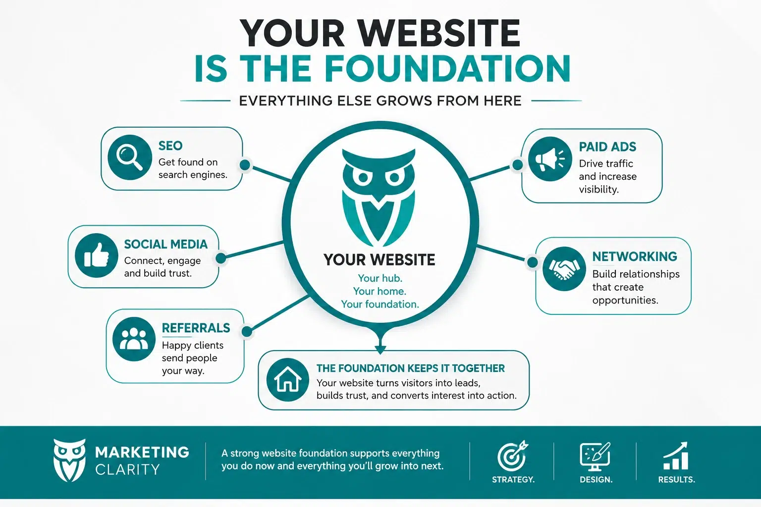 A strong website gives your marketing somewhere solid to point. That is exactly why I approach WordPress web design with copy, SEO, structure, and user experience in mind instead of treating the website like a pretty digital brochure.
The Emotional Relief of Finally Liking Your Website
People often talk about websites in terms of leads, traffic, rankings, and conversions. Those things matter. Of course they do.
But there is also a real emotional shift that happens when a business owner finally sees a website that reflects them well.
I once built a website for a nonprofit created in honor of the owner’s mother. When he saw the finished site, he cried because he was so happy to see her honored that way.
That kind of reaction is bigger than design.
For many business owners, a website becomes something they carry around mentally. It sits on the to-do list. It creates stress every time they think about promoting themselves. It becomes one more thing that makes the business feel heavier than it needs to feel.
When that weight is lifted, people feel lighter. They feel more legitimate. They feel excited to share what they do. They can finally send the link without cringing.
Should You Keep Promoting Your Business If Your Website Looks Bad?
Yes, you should keep promoting your business.
If the messaging is clear and the website can still help people take action, keep sharing it while you work on improvements. Your business does not need to disappear while your website is being fixed.
At the same time, there is value in stopping the bleed.
If your website is actively costing you leads, confusing visitors, or making you avoid marketing altogether, address it now. Fix the problem while you are still operating the business. Get it moving in the right direction so your marketing efforts have a stronger foundation.
You do not have to choose between promoting your business and improving your website. You can keep showing up while making the website better.
Your Website Can Be Fixed
If you are embarrassed to send people to your website, take a breath.
You are not stuck with it forever. You did not ruin your business. You do not have to keep avoiding the link, sending people to social media instead, or hoping nobody asks for your URL.
Your website can be changed.
Start with the pieces that create the most friction. Improve the photos. Clarify the headline. Add stronger calls to action. Clean up confusing pages. Make sure people understand who you help, what you offer, and how to reach you.
And when the website needs more than a few fixes, give yourself permission to rebuild it with a better strategy behind it.
Your website is not set in stone. It can always be changed.
You do not have to stop marketing your business because your website is not perfect. Keep promoting. Keep serving your clients. Keep moving forward.
Just stop letting a website problem quietly turn into a business problem.